

Stifled - Visual in Echo
- chen wei ren
- Jun 14, 2019
- 4 min read
Updated: Jul 2, 2019
I will be briefly going through the process of creating the unique black and white visual look in the game.

You throw an object, it hits something and it creates a pulse. Anything that is in the pulse will get "lit up" and be rendered with white lines.
The early implementation of the echo lines (aka white lines) is by using and modifying the normal edge detect shader that comes with the Unity game engine. As the name of the shader suggested, it draws the white line based on the normal of the mesh.
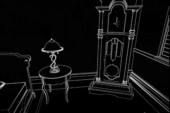
But as you can see from the above image, the lines are rather fuzzy and inaccurate. Take a quick look at the clock face, part of it is not even drawing properly. Now take another quick glance at the table lamp, you can see a lot of white dots and the thicker than usual white lines. These are caused by the normal map applied to the mesh and inaccuracy of the shader respectively. Our programmer did modify and exposed a few variables to control the shader, but there is still quite a lot of limitations.
So we decided to switch to another method. Let's call it the Sub Object method. We are still fundamentally using the same shader to draw the line but to increase the accuracy and the amount of control we have over the look, we break the down the mesh into many sub objects. The white line will now be drawn around each of the sub object. No more relying on the shader to "guess" where to draw the lines. And no more interference from using the normal map. The process of breaking the mesh apart is done in 3DS Max.

So far so good, we managed to achieve a clean and predictable visual look! But of course, life isn't always so simple. By breaking the mesh into many smaller objects, we increased the number of objects in the level by many, many folds (can be as much as 4-5 fold). As expected, Unity game engine doesn't like that and the performance of the game drops. And so we marched back to the drawing board.
The next method is called the Vertex Color method. No surprise, we just use the vertex colors stored in the mesh. The shader will detect each color and draw a line around it.

The colors are assigned in 3DS Max. I just need to break the mesh into sub element (this is different from breaking 1 mesh into sub object as you can technically have 1 mesh and multiple elements). Once broken, I wrote a tool that will auto-generate random colors and apply them to the vertices of each element.
But the downside of this method so far is that the shader recognizes and draws lines strictly by color. So if I have multiple copies of a mesh, the same color will start to overlap with one another (imagine all the overlapped pink color of the toy train will be sharing one white line).
So to address that problem, we created a script called Echo Layer. This script simply loops through the elements in the mesh and assign a unique ID randomly. Each unique ID corresponds to a unique color. To further control the randomness, we then added a tool that will generate unique IDs for all the meshes in the scene with the Echo Layer Script with a single click. This way, all the elements of all meshes in the scene will have a unique ID, and thus, a unique color. No more overlap of color.

So we ended up with a winning solution! But let's examine the pro and con.
Pro:
Usage of elements allows us to keep it a single mesh. Good for performance.
Vertex color is already presented in all meshes (default is pure white).
Not affected by normal map.
Con:
Require setup in 3DS Max. Definitely added additional work.
Need to add Echo Layer script to every mesh. More work.
Relying on color can be tricky. Colors that are too close in range can still merge, although rare. For example, color 255,255,255 can merge with color 255,255,254.

This is the final look! Noticed the thinner white line? The programmer decided to sweeten the deal by varying the color of the line to add a sense of depth to it.
If you have made it so far, I will throw in an extra feature we added.
Look at the image below carefully. Does it look like some random abstract art you can find in some art museum or on the internet? Can you guess where is it? Which is the floor, the wall?

This is a problem we faced as players tested our game. It can be pretty disorientating if you lost track of where is the ground and the ceiling. Especially in the level such as the cave where the floor, the wall, and the ceiling are just rocks (sorry rocks, you all look the same).
So we came up with another not-so-fancy named method/feature, the Close-by Echo Texture. We rendered the diffuse map of the meshes in gray-scale on top of the white lines. This added a sense of depth. The texture will also fade off over distance.

But since we have a lit scene in the game, the diffuse map is needed to display the texture. Some diffuse maps are dark (eg. mud, rock), some are bright (eg. metal). The usage of diffuse map means we lost control of the ability to control the look of the Close-by Echo Texture since the brighter is the diffuse map, the brighter is the Close-by Echo Texture.
The solution is to use the Alpha channel in the material slot. Since we seldom use alpha channel, it is an okay compromise.

Left: Diffuse. Right: Alpha Channel.
We can now easily control the brightness of texture in both the lit scene and the echo scene.
For the final version, we toned down the brightness in echo so that we can still retain the sense of fear (it is a horror game after all).


Comments